When our Interaction Design class was given the open ended brief of addressing a common pain point or problem through a digital solution, my group’s answer was instantaneous and unanimous: we all had issues with the school’s transit system.
So we set out to create our dream product - a reliable, proprietary trip planning solution for Whatcom Transit users to use instead of the clunky, existing web tables that were in place.
My Role
Sketching/Wireframes
Prototypes and Mockups
User testing
The Problem
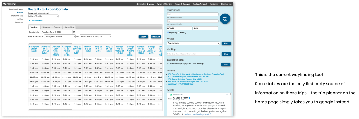
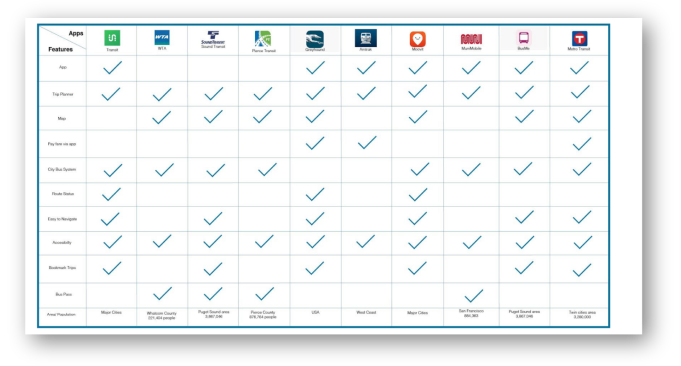
Currently, the only way to get first-party WTA bus information is through their website - which isn’t that great.
We were intially approached with the open-ended brief to redesign any website, app, or service. As a team of four WWU students who frequently use the bus system in Bellingham, we decided initially to redesign their website.
This was born purely out of spite for the clunky and unintuitive system currently in place - the website was the only way to digitally acquire first-party route information from WTA. But the trip planner was convoluted and inaccessible on mobile.
Step 1 - Research
We used research to better understand our market and our users.
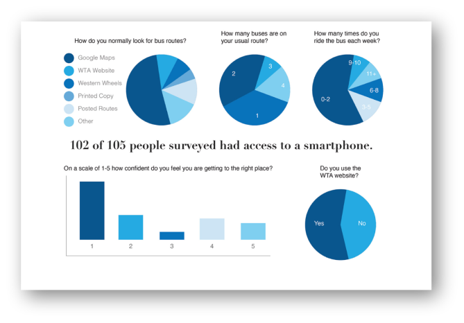
We started with a user survey to better understand the behaviors of current WTA riders. We found that the majority of them had access to a smart phone, and that the vast majority turned to Google Maps. Qualitative surveys indicated that mobile solutions were preferred over desktop optimized experiences.
It’s worth noting that the reliability of WTA transportation is already fairly tenuous, so users value getting information that feels trustworthy - in other words, they’d prefer first party and branded sources over Google Maps.
We then ran through competitive benchmarking and determined that there was nothing on the market currently that was sufficiently feature rich or intuitive.
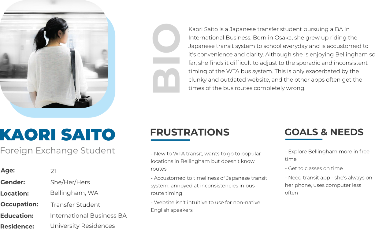
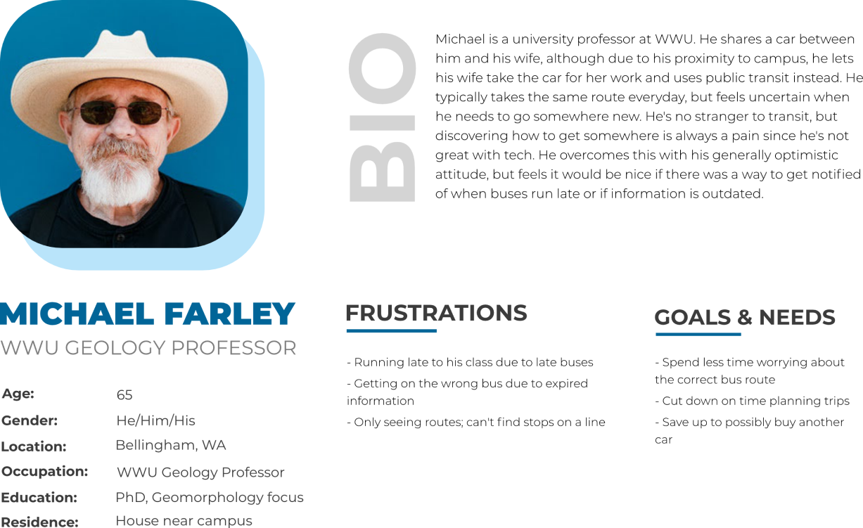
We then created user personas to understand the needs of the diverse population of riders.
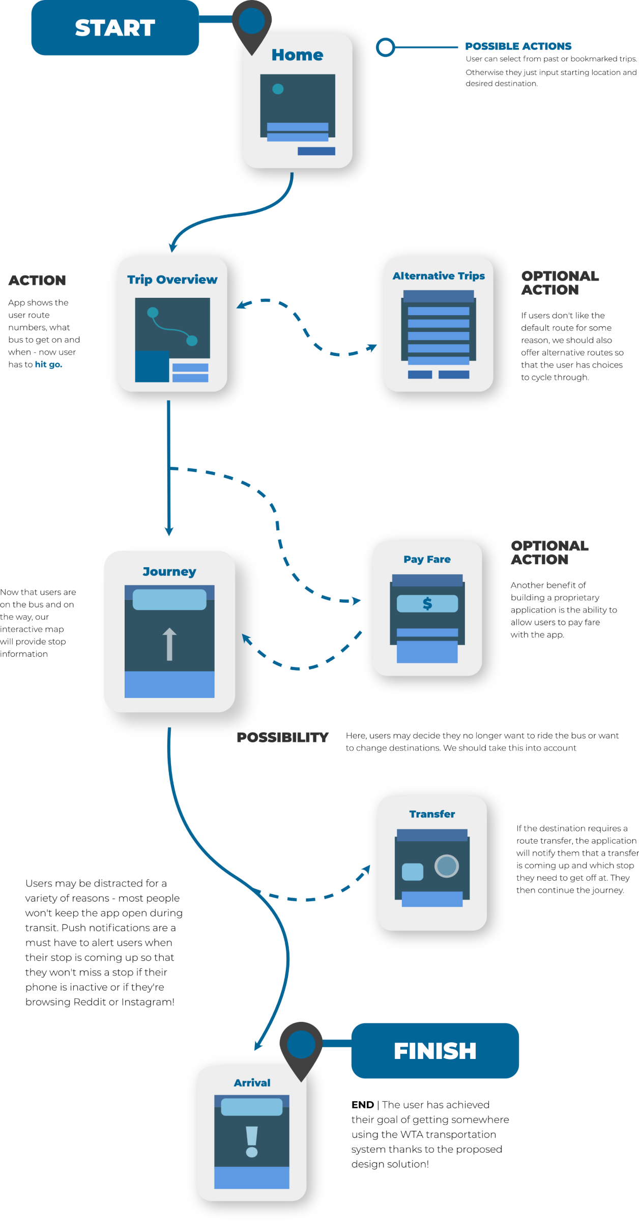
Using those insights, we created a basic user flow of a wayfinding app from start to finish
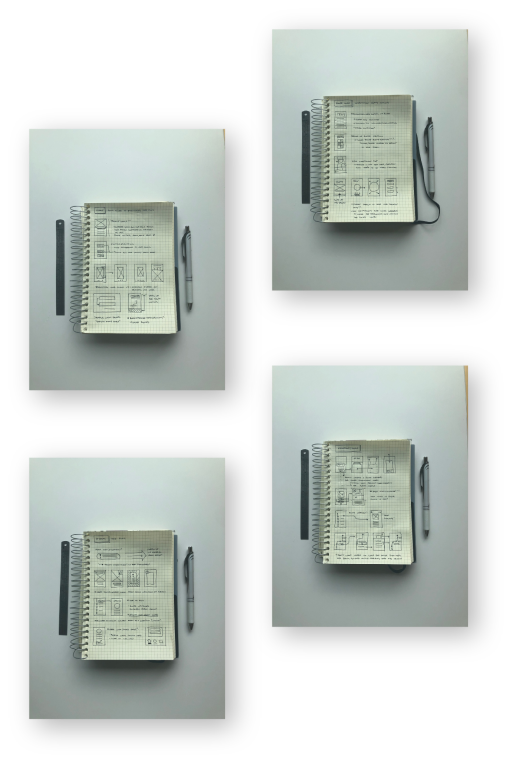
Once we knew the flow, we used sketches to ideate on screens.
These extremely low fidelity wireframe sketches allowed us to explore how we wanted the app to feel without being immediately constrained by the minutiae of pixel-pushing UX elements around. We tried to be as open minded as possible, as this was still in a divergent line of thinking.
Afterwards, we mapped our sketches to preliminary paper prototypes (not pictured). This was then tested against classmates and transit users to iron out basic flaws in the flow.
Step 3 - Prototyping
From here, we worked on prototyping with the RITE methodology in mind.
Rapid iterative testing and evaluation was done to polish the prototype as quickly as possible while still validating our design decisions. Betwen each sets of tests, we issues with affordances, learnability, and poor visual design that led to confusion.
One key takeaway was that although testing doesn’t have to be conducted on finished highest-fidelity mockups, we should strive for a level of fidelity that doesn’t cause confusion, as that is an easy fix and will distract testers from more subtle insights.
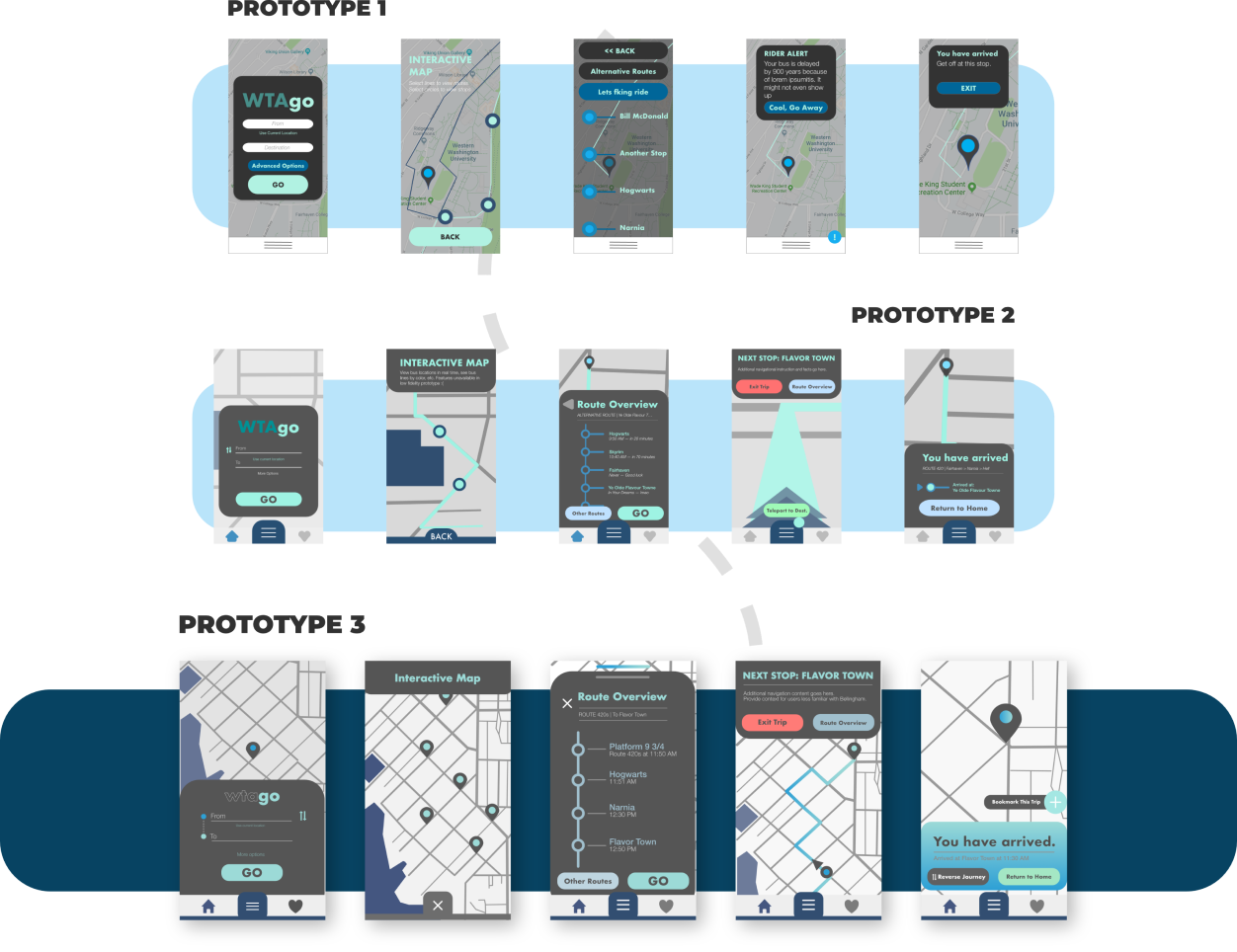
Despite all the testing, our first try at high fidelity mockups was still flawed.
The tricky part here was that testers still responded positively to the visual design. They enjoyed the bright colors, and the underlying UI was clear and polished thanks to the work done during our iterative testing throughout the prototyping phase.
However, it failed to deliver on one of our core goals - make the app feel first party and branded.
This was my first experience doing visual design, and as a result, I didn’t have sufficient design acuity to realize that our current design language drew too much inspiration from Google’s Material Design suite. This was especially problematic as Google Maps was a strong competitor in our market niche. We had to start over from scratch.
Revisiting the rebrand
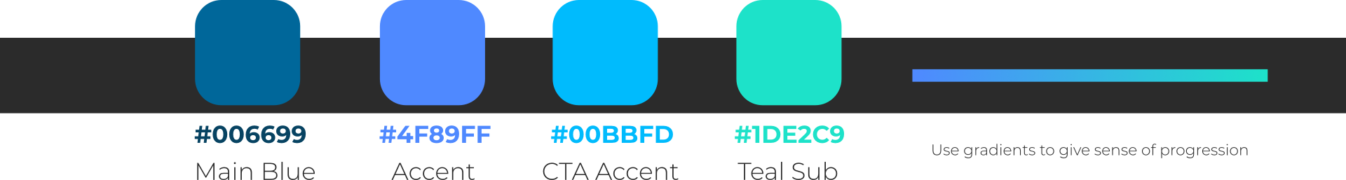
We figured we should’ve been more subtle in our rebranding efforts - we kept all the current elements that was central to the WTA identity: their primary blue, their usage of Futura, and the general subtle playfulness of WTA.
We then selected accent colors by modifying saturation and luminance values from the existing blue, opting to stick with an analogous color scheme so as to not visually overwhelm the users. This also allowed us to place emphasis on any direct calls to actions.
We also modified our UI elements to feature rounded bezels to create a more cohesive feel in the final product.
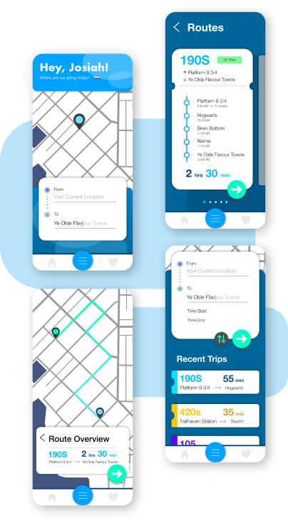
After our rebranding work was tested and validated, here's our final product:
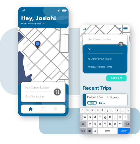
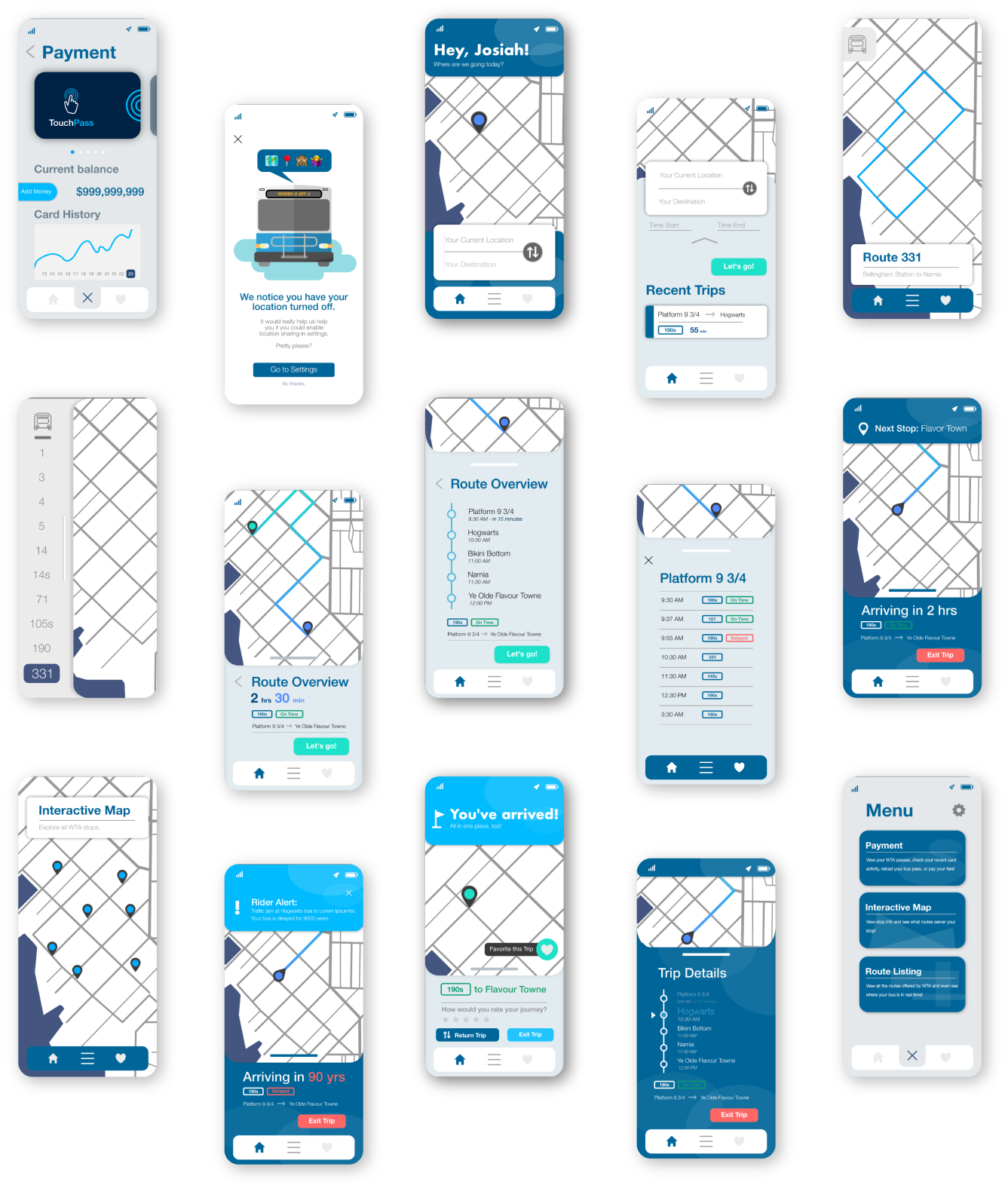
Main Screen
Our final main screen included a personalized greeting to the user as an attempt to design for emotion. We grouped the UI elements towards the bottom after realizing during user tests that placing the input cluster in the middle was harder to reach for those with smaller hands on bigger phones.
Route Overview
We found throughout the process that having a clear overview of the entire route made users feel more secure. During the ideation phase we also came up with the idea of using a gradient to convey a sense of journey as well.

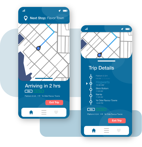
Rider Journey
Intentionally straightforward, users can swipe up to see where they are in the context of the entire route. The next stop is displayed at the top to make sure that riders are always aware of where they are even without the overview. Ideally, the app would take advantage of proprietary data to let users know if they’re running on time.
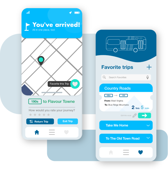
Arrival and Faves
We’ve used the brighter accent colors to alert users when their ride comes to an end. Additionally, we revamped the favorite trips page to include a bus illustration and placed each ‘trip’ into a ticket to keep the tone of the app light and playful.