Airbnb Eco
“How might we help Airbnb’s community be more environmentally friendly?”
“How might we help Airbnb’s community be more environmentally friendly?”
During Spring 2021, WWU and Airbnb teamed up to explore the various ways in which the company could address the various environmental and sustainability concerns that inherently arise from being a key player in the travel industry.
Ultimately, we came up with Airbnb Eco - a rewards program to help guests prioritize sustainable travel and environmentally friendly practices while empowering local communities.
Flows, Wireframes, User Research
Wireframing & Prototypes
Mockups & Final Presentation
This was the open ended brief given to us by Ryan Scott, a design lead at Airbnb and our project manager.
Our multidisciplinary team was tasked with focusing on the guest experience. In a little under three months, we produced a scalable, guest-facing solution that would help Airbnb promote environmentally friendly behavior.

Our capstone project created a rewards program to encourage sustainable behavior. This program also addresses business needs by increasing user retention while acknowledging sustainability in a holilstic sense by bringing communities closer as well.
We conducted market and competitor research in an effort to gauge traveler sentiments on sustainability.
Our market research confirmed that guests do care about sustainability - it’s just “much less important to consumers than things like price, type of destination, convenience and amenities”.
We also found through competitor research that very few competitors offered ways to guide guests to sustainable stays. More importantly, we came to realize through our research the massive impact key players in the travel industry have in local community.
We started off with a set of preliminary user journeys (shown below) for the existing experience, created with the context of sustainability in mind. We wanted to see for ourselves how Airbnb’s current Guest flow was handling sustainability, and tackled this through two perspectives: users that are interested in sustainability, and those that aren’t.
From this, we realized that even though research shows that 88% of Airbnb hosts already incorporate green practices in their listings, it’s currently impossible to find which stays are more or less sustainable.
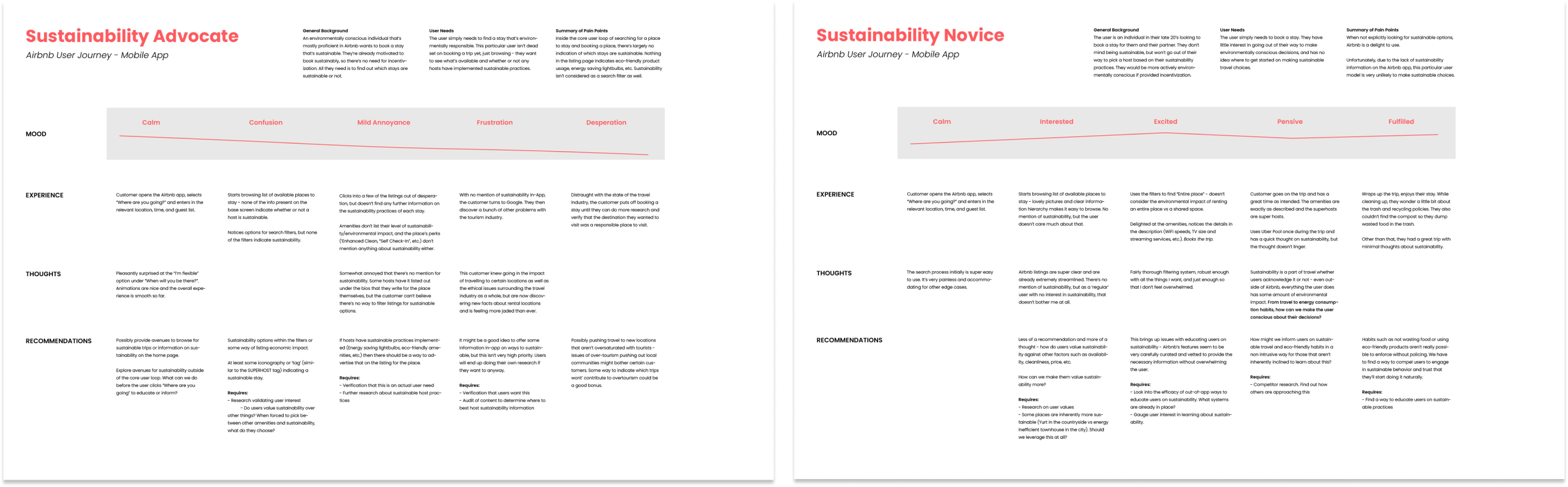

There’s no information on any of the listing pages for which hosts are staying eco friendly. Even the amenities section lacks any sort of sustainability information.
Ultimately, we found that even if guests wanted to, it’s impossible to make sustainablle choices in the existing app.
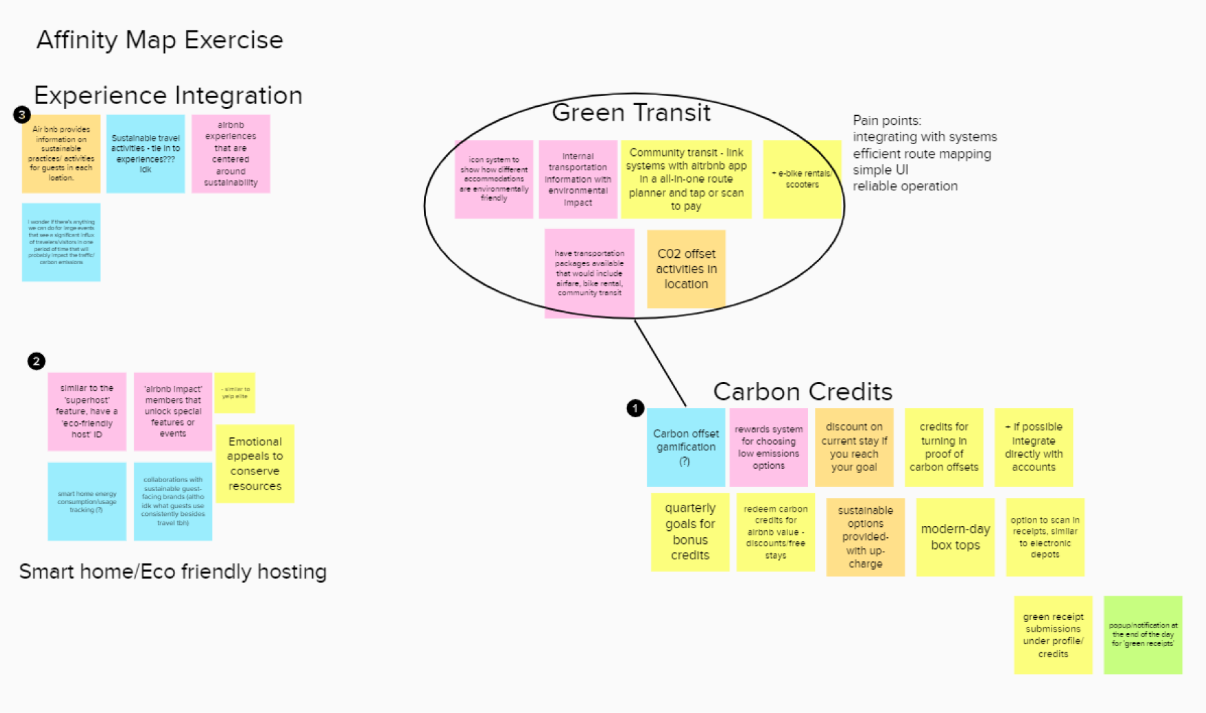
We used an affinity map to organize our ideas on how to better build eco-friendliness into the existing product. We were particularly intrigued with ideas that married sustainability with community after reading so much about how local community is affected by travel.
Eventually, our efforts brought us to the idea of a credit system to track sustainable stays. This incentivizes those that are on the fence to make sustainable choices, while providing those that are already eco-inclined more information to make their decisions.
We had a good idea of the core flow going into wireframing, but we stayed open minded. This helped us to expand on our ideas as we went along.
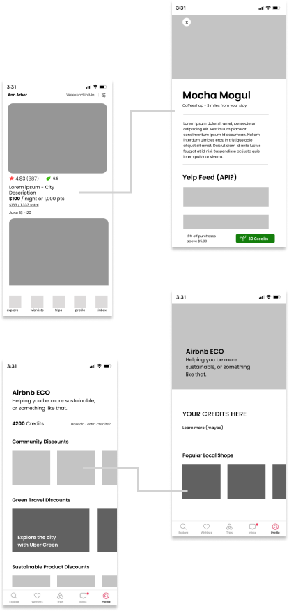
For example, while making screens for the listings, we also came up with the idea of creating the ‘hub page’ for all the Eco information. A large part of where our touch points for this new program would come from our wireframing efforts.
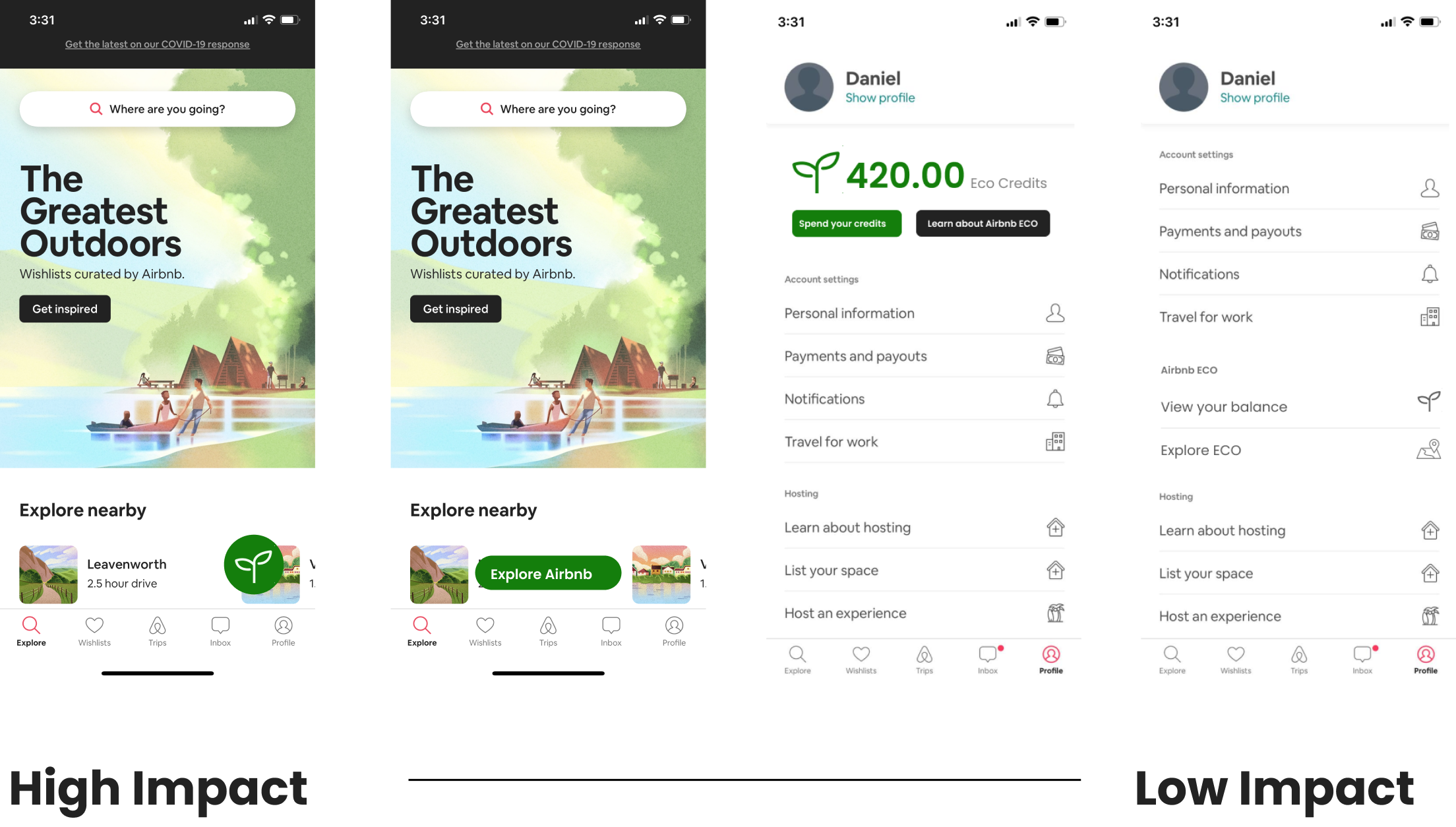
In our initial pitch of the idea to the project manager, we discussed where touch points for the hub page would be located. We learned that in a product as large as Airbnb, you had to fight for any amount of space on the home screen or the nav.
Luckily, we planned a range from high-impact to low-impact touch point placement, so we were able to discuss freely and come up with a compromise between the last two low-impact screens during the limited meetings that we had.
Making the wireframes to pitch to our project manager gave us solid enough insight into the flow and identity of the product to where we felt comfortable jumping right into high fidelity prototypes. This was made possible due to there being an existing Airbnb DLS (design language system) that we had to adhere to, which meant that we didn’t have to design anything new. Instead, all we had to do was imitate existing assets.
We ran our figma prototype through three rounds of user testing and fixed little issues with affordances and learnability along the way.
You can view the clickable prototype here.
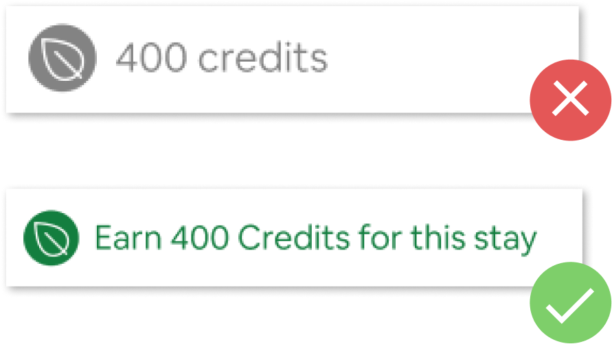
In typical designer fashion, we wanted to solve all of our problems with pretty badges or clever visual design. Our first round of user testing showed us that sometimes it’s better to just keep it simple with the copy writing and make affordances abundantly and unambiguously known.
After changing our copy, our second round of testing saw a 100% success rate (5/5) with tasks involving that change, which was a marked improvement from before.
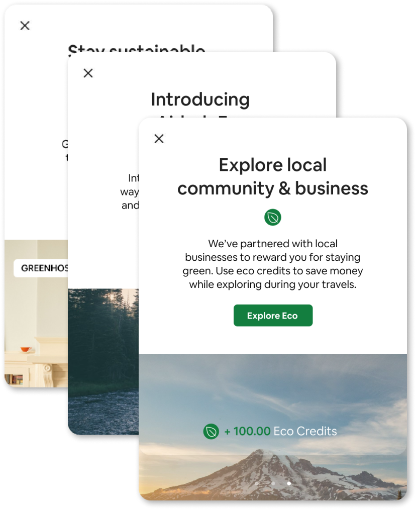
During one key user test, a participant noted that certain test scenarios were unrealistic - not a lot of people are just lounging around at small shops and think to pull out the Airbnb app for discounts. These same participants didn’t know that Airbnb Experiences were a thing either.
We realized quickly that we would have to provide onboarding steps to inform users of the new feature.
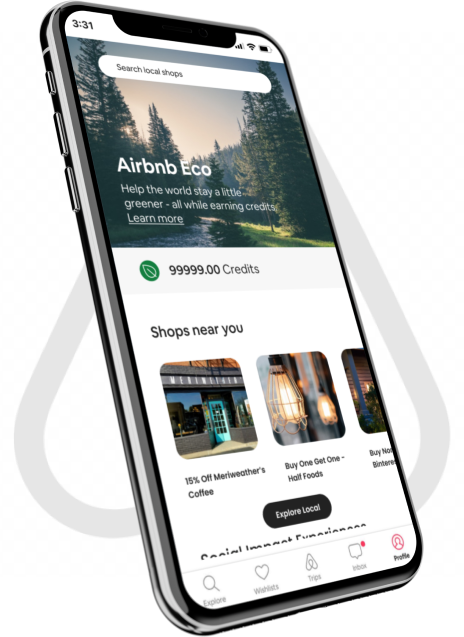
From the get-go, we realized we would need a centralized location to host all the pertinent info related to Airbnb Eco. We created this 'eco hub' page, where users can learn more about the basics of the program, view their balance, find discounts available through credits, and more.
We built this page to be modular and scalable using the existing DLS so that it can grow with the program.
One of the things we quickly realized while working with Ryan was that a centralized location wasn't practical and didn't fit in with the platform's design ethos - instead, we created multiple ways to get to the page. User testing later confirmed that this was more effective than keeping it tucked away in the nav or in one location.
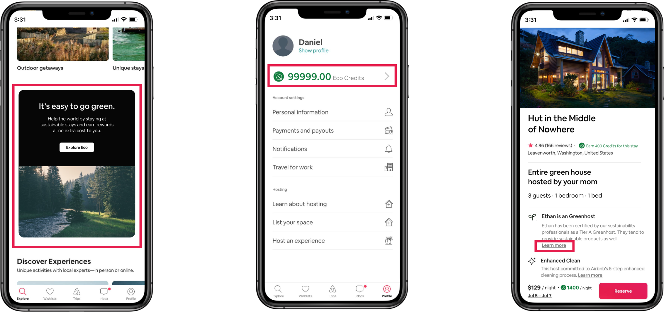
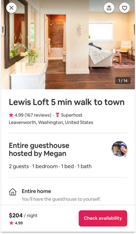
A major pain point we identified early on during our user flows was that users couldn't be sustainable even if they wanted to, since there was virtually no sustainability information on the listings. We made sure to add icons and information so that users can see which hosts had sustainable stays.
The rest of the checkout flow is more or less the same - we built our feature into the existing flow without the addition of any new screens to make the process as unobtrusive as possible.
Similar to the eco hub page, we made sure to made the shop listings accessible through multiple touch points as well - this information is available through the trips tab, but it's also available through several touch points on the eco hub page as well.
All users would have to do is to find a discount that interests them, pull up a QR code, and scan it at the relevant business. We did some preliminary research with popular POS system's APIs to make sure that this was feasible, and the integration should be fairly seamless with Airbnb's app.