WWU Move-In App

Designing a solution for the first socially distanced move-in process...on a deadline.

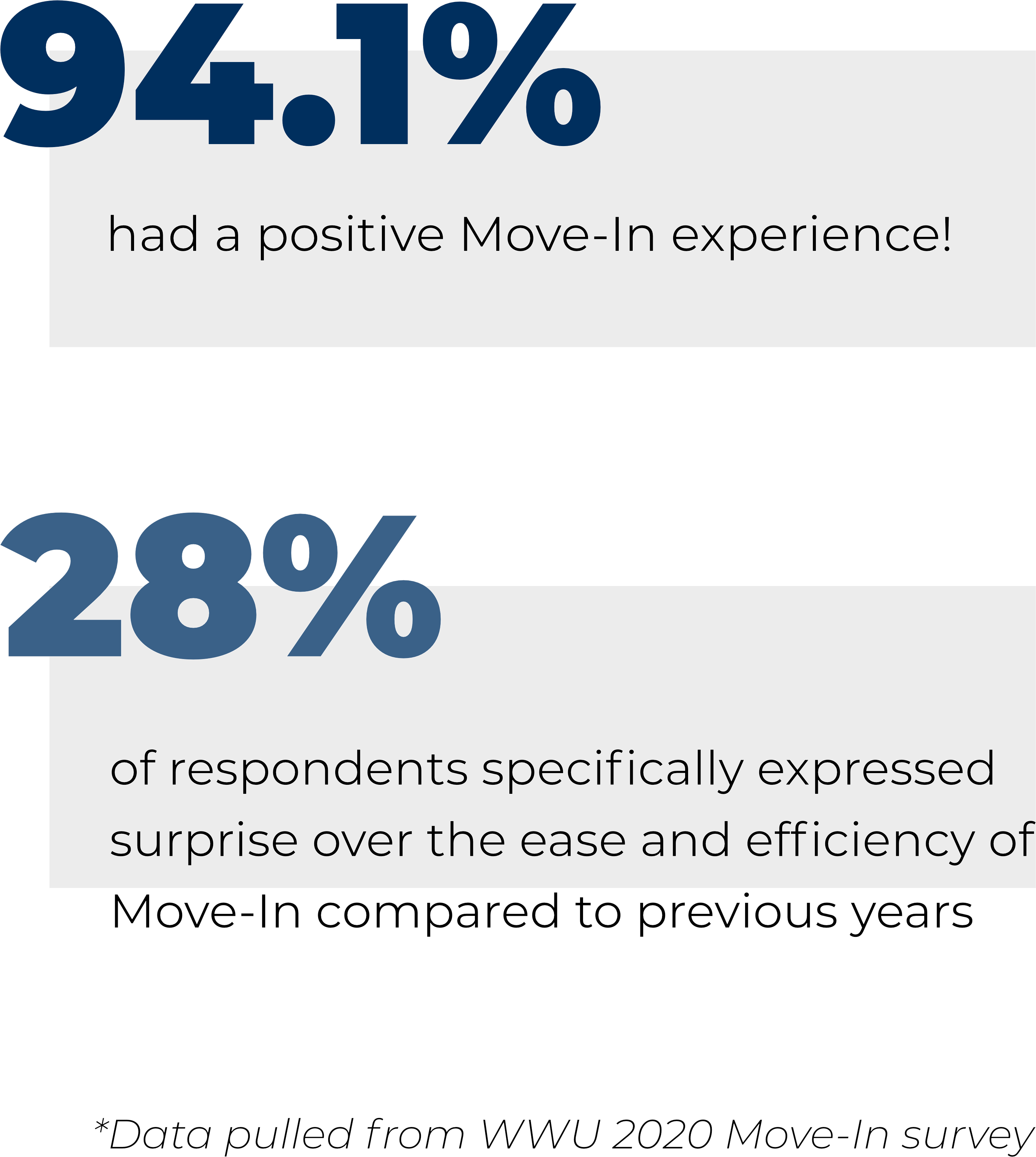
The first year of COVID presented a couple of unique challenges for Fall Move-In. University Housing decided to make an app to schedule and manage the Move-In times for Fall 2020.

As a member of the design team at Restek, I was presented with the unique opportunity to design a web-app and be a part of the product's journey from start to finish.

My Role

Researching

Wireframing

High Fidelity Prototyping

Timeline

August 2020

The Problem

"How might we facilitate a socially distanced move-in process?"

We’ve all heard the words “in these unprecedented times” at least a billion times by now, but back towards the end of Summer 2020, University Housing was only starting to realize that COVID wasn’t going away anytime soon.

And that meant a socially distanced move-in.

Move-in is an inherently messy time for any university, but the added challenge of an unprecented global pandemic forced us to revisit the process entirely and design around quarantine constraints.
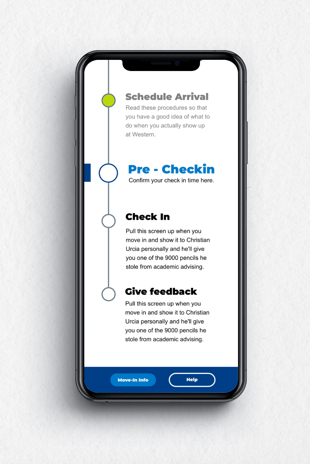
Solution Preview

Create a web-app to provide information and manage move-in timeslots

Since a lot of the move-in process info was already handled digitally, University Housing decided to further commit by creating specific timeslots for move-in and hosting that experience on a new web-app that expands on the current process.

As a designer on the Restek team, I had the privilege of collaborating in a multidisciplinary environment to design the flow and layout of the app on a deadline.

Step 1 - Research and Ideation

Learning to handle ambiguity with a tight timeframe and project deadline

The decision to create a new web-app to facilitate move-in was made fairly late in the game. By the time the design team was informed of it, we were left with just a little under two weeks to assist in the design.

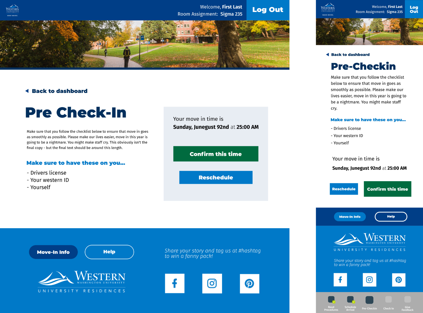
We were presented with a rough idea of the user flow and a few other logistics - that QR codes would be required on move-in day, that a scheduling page would be needed, as well as some auxiliary pages to display info.

Given that information, we began to start planning right away.

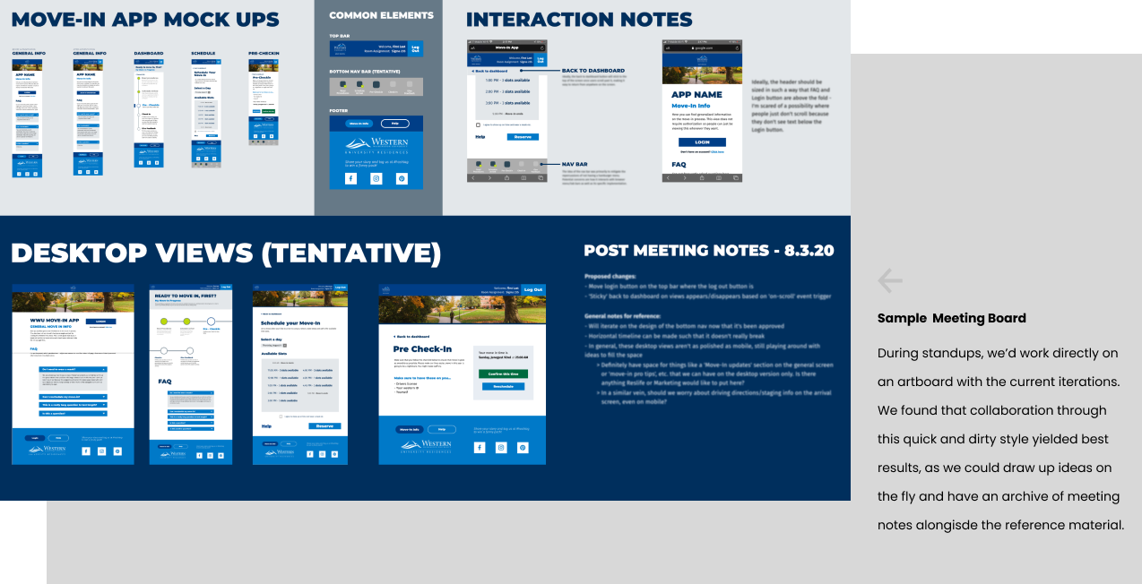
In one long afternoon meeting, we ironed out the specific steps in our user flow. Each major step in the move-in process would require its own dedicated page, and while we weren’t given the specifics of what would need to be on each page, we were able to take an educated guess and adjust along the way.

Because we were designing on a deadline, a lot of the underlying development was already underway, which also meant we needed to coordinate with the engineering team on priorities and requirements.

Step 2 - Product Audit

Due to time constraints, we moved right into wireframing.

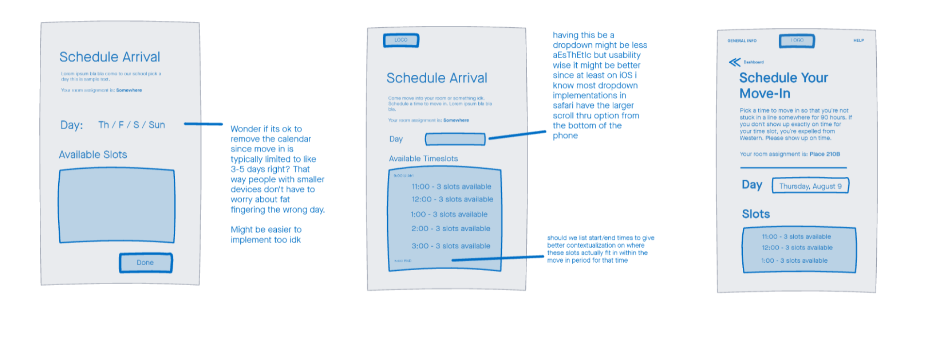
Our team later met on invision and spent a few hours hashing out different layout ideas on the virtual whiteboard. The biggest hurdles here were designing the actual scheduling process and placing it within the broader context of the app’s flow, as a lot of the details and specifics weren’t made known to us until well into the design process.

We initially wanted to include a calendar widget, but realized that would be inefficient as move-in would at most span a week and there would be multiple options per day for move-in time slots. In the end, we settled for a series of drop downs, which was also more mobile friendly and cut down on development time.

Step 3 - Prototyping

Rapid prototyping through a design system and adjusting for changes in status quo

Once we had approval on the wireframes and the flow, we quickly moved on to high fidelity prototypes.

We leveraged the existing design system and pattern library’s components in our prototype. This had the dual benefit of making development easier, as the code for all the components already exists, as well as ensuring that the end product would feel like an extension of the housing website and fit into existing branding.

In our meetings with the engineering team, we’d make sure to cover key interaction notes and take input on what would be feasible to implement. A lot of our earlier ideas were impractical, but through communication we were able to tone down the project into something realistic and achievable while still staying true to the core user flow.

Step 4 - Handoff

Designing for development and taking necessary shortcuts

Even though the experience was designed to be mobile-first, we still had to make sure that it was accessible on desktop as well since this was a web app.

Luckily, since we were familiar with the HTML/CSS frameworks used by the housing site, we were able to design the desktop layouts in a way such that it would be easy to implement.

Our deliverables were the core flow and the high fidelity prototypes. Once we produced all the necessary screens and verified with the developers that the components/interactions were feasible we were done.

A bit more time was spent later on creating custom iconography, but that effort was later tabeled for a higher priority project. The google material design icons were used instead to save time.

Step 5 - Reflecting

Reflection and Retrospective

Despite this not being the most aesthetically striking project, or the most interesting one, I 'm proud of the work we did over those two weeks. This was my first proper UX project outside of case studies, and I felt like I learnt a lot about the process as well as what it meant to collaborate with others in cross-functional teams to meet deadlines.

I was satisfied with the overall process and how we approached the design challenge, but there was still a few things I would have changed looking back.

1.
Making time to test

We definitely didn't have a lot of time to work on this project, and in the moment, the design team was so excited to get our hands dirty that we didn't think consciously about the UX process as a whole.

We spent all the limited time we had in designing the prototypes and working with the developers, but we definitely should have actively made time to test. While we did do some quick and dirty user tests with Restek employees that weren't assigned to this project, it would have been nice to divide up the work to make time for formal user testing.

2.
Tools Matter

Since the other designers were also working on other projects, I was solely responsible for producing high fidelity prototypes. Since speed was a concern, I defaulted to using Illustrator at the time, since that was what I was most comfortable with. However, this made collaboration difficult when other designers wanted to hop in to make small changes.

In retrospect, using an online tool like Figma would have saved us time in that regard. Additionally, Figma's built-in CSS tools potentially would have made for an easier hand-off.

- Other Projects -

Airbnb Eco WTA App Concept Mental Reminder